Logo
Our logo combines our primary color with a stylized representation of the letters "O" and "D." It is available in three variations: the full logo (main), the logo icon with text (avatar + text), and the logo icon alone (avatar). Use these variations as needed to maintain brand consistency across different formats and platforms.

Logo on top of solid color
For optimal appearance, display our logo on a light background with sufficient surrounding clear space.


One color
The colorful logo should always be the first choice. However, if necessary, the one-color version may be used in these two cases:


Typography
Typography is essential in conveying OneDeck's unified personality. Consistent use of brand fonts is crucial to preserving the brand's approved visual language and style.
Colors
These are the official brand colors, intended for use as backgrounds and visual elements in all brand materials.
Product elements
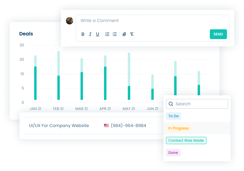
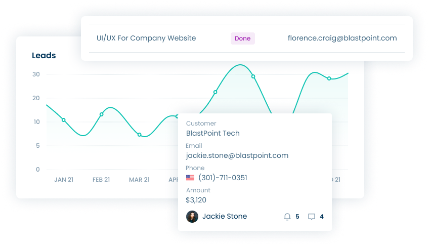
When showcasing our platform, we strive to integrate product elements with real-world visuals. This balance is achieved through the use of images and human elements, as demonstrated on this page.
Marketing materials
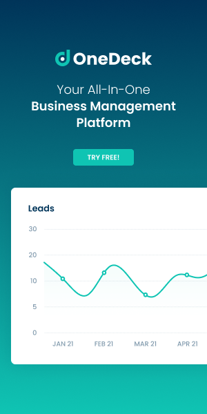
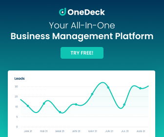
In promoting our brand, we emphasize a blend of visual impact and brand consistency. The banners in this section represent OneDeck's marketing materials, designed to convey our brand identity across diverse channels effectively.


